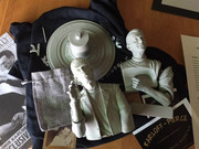
PART 3
When it comes to applying pastels to a kit I have a very 'loose' style of application. That is to say I frequently switch from color to color and feature to feature as my mood strikes me. I never fully apply one color, or finish one area, before moving on. And I frequently find myself moving the brush back to areas where I've already applied pastels either to brush on a different color or to deepen one I applied previously.
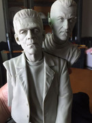
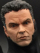
I should also mention at this point that I repainted the Pierce portrait because I didn't like the job I had done.
This is something beginners should keep in mind: just because you painted something doesn't mean you have to live with it. It's only paint. Do it over again if you don't like the job you did.
In my case I wasn't happy with some of the speckling I did on Pierce's face and so simply repeated my process outlined earlier - including the washes - and ended up with something I preferred.
So - on to the pastels...
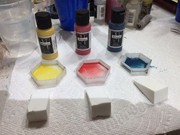
I have a set of pan pastels that I've been using for a few years ever since Greg McKellar showed their uses at a JerseyFest lecture I attended.
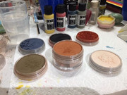
You get enough pastel powder that, barring an accident, you'll probably have them for the rest of your life (and then some).
Laid out from left to right and top to bottom are: Payne's Grey, Black, Red Iron Oxide, Raw Umber, Burnt Sienna and Burnt Sienna Tint.
The set also came with (not shown) four other pans of greys, raw umber tint and white.
I also had four other colors (not shown) that were ground on a piece of sandpaper: Cobalt Blue, Violet, Juniper Green (dark green) and Nougat (a milk chocolate brown)
To apply pastels I just use a couple of different sizes of brushes that are no longer suitable for precisely applying paint. And when I switch between colors I simply wipe them quickly on a paper towel to remove most of the pigment.
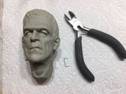
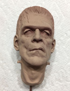
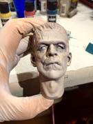
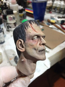
The monster has the most interesting face for pastel application:
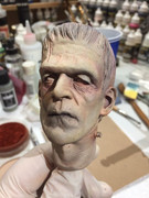
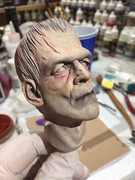
Under the harsh light conditions some of the colors may be hard to detect but I used the Raw Umber in the recesses below the heavy brow/above the eye to create a shadow. I also deepened it with the Payne's Grey.
The raised areas of the cheeks, chin, the tip of the nose/nostrils, and the ear lobes/tops of the ears get Burnt Sienna. The application is
light. I usually dust on some pigment, apply it very lightly,
blow off the excess and work what remains onto the surface of the kit.
Under the eyes I applied the Burnt Sienna, and deepened it with Red Iron Oxide.
I also used a little blue and purple under the eyes and at the temples.
Payne's Grey, Raw Umber and Black were used in combinations on the sunken part of the cheek, the mouth and the hairline. Once paint is applied to the hair the shadow will take on a different look
Purple, Blue Cobalt, Red Iron Oxide and Burnt Sienna were used around the electrodes to show bruising and irritation. The gashes on the head and neck will also be 'distressed,'
Any deep recesses in the face where there are shadows are emphasized with Raw Umber.
Anywhere I think I've gone too far with either the Red Iron Oxide or the Burnt Sienna I use Burnt Sienna Tint. It knocks the color back.
I'm not a huge fan of a green Frankenstein monster but when it's don'e right it's fantastic. I did use green as a tint for the monster's portrait with just a hint on the brow, the jawline, the chin and the eye lids. It's so subtle I don't think the camera picked it up.
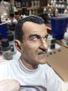
For Pierce, the process is the same but with fewer colors applied.
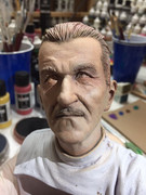
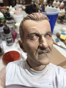
One difference with Pierce is that he has facial hair. So, the eyebrows and the moustache get Raw Umber to create shadow.
I don't use pastels to create a five-o'clock shadow because that's what the blue wash was for when I was painting the portrait. To my eye, the wash does a better, more realistic job of creating that shadow.
Still to come: Detailing the faces, the torsos and the base...